Need Complete Digital Marketing solutions for your business? Request Quote

Responsive Web Design

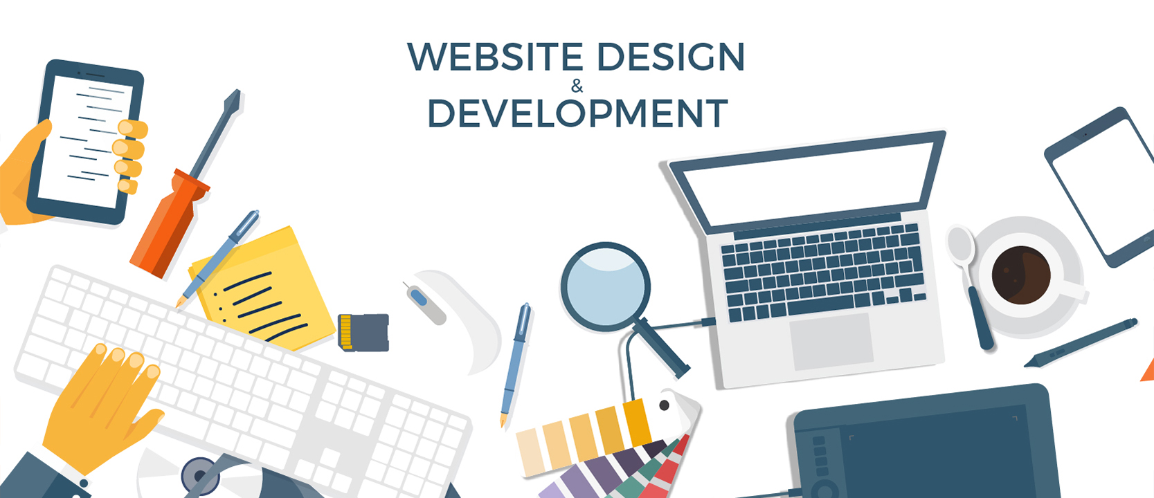
Responsive Web Development company Bangalore

Adbangs Technologies is one of the best Responsive Web Designing Companies in Bangalore. Responsive web design is a technique to make a website design, which adjusts the content of it through web specification standards and flexible design models. The reason behind it is to make the accessibility of websites to devices of any size. Responsive design makes sure that a website displays all its components properly on all devices like desktops, mobile phones and tablets.

Responsive and adaptive web design are closely related, and often transposed as one in the same. Responsive generally means to react quickly and positively to any change, while adaptive means to be easily modified for a new purpose or situation, such as change. With responsive design websites continually and fluidly change based on different factors, such as viewport width, while adaptive websites are built to a group of preset factors. A combination of the two is ideal, providing the perfect formula for functional websites. Which term is used specifically doesn’t make a huge difference

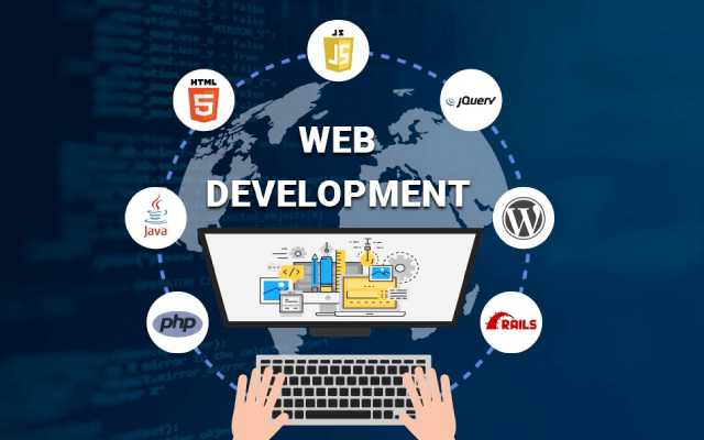
Responsive web design mainly works on Cascading Style Sheets (CSS), using different settings to show different layout properties depending on the screen size, orientation, resolution, and other characteristics of the user’s device. Responsive web design also makes use of CSS properties like media queries and viewport.

Because of responsive design, the web designers and UI developers do not have to work hard and create websites for all the different devices available. It also gives a pleasant and friendly view for the users, website owners and everyone who visits the website.Almost every new client these days wants a mobile version of their website. It’s practically essential after all: one design for the BlackBerry, another for the iPhone, the iPad, netbook, Kindle — and all screen resolutions must be compatible, too. In the next five years, we’ll likely need to design for a number of additional inventions. When will the madness stop? It won’t, of course.

Here are a few benefits of responsive web design:

• Single website for all the devices: It does not matter that you are seeing the website on a large desktop screen or a smaller mobile screen, the website adjusts itself according to screen size for pleasant view of users.

• Flawless design for every device: Not only the layout, but also the images, font-sizes, tables, charts and other elements adjusted properly irrespective of the screen size with the help of responsive web design approach.

• Easy to maintain and update: As we discussed we don’t need multiple websites for different devices therefore, we don’t need to post the updates for every single website. Once we update it will reflect across all the devices.
Responsive web design also has significance over cost point of view. You need to maintain just a single website in place of multiple. Adbangs Technologies is a popular name for Responsive web design in Bangalore at a very reasonable price.
Responsive web design is the practice of building a website suitable to work on every device and every screen size, no matter how large or small, mobile or desktop. Responsive web design is focused around providing an intuitive and gratifying experience for everyone. Desktop computer and cell phone users alike all benefit from responsive websites.

Responsive web designing is remarkably different from traditional designing in terms of technical and creative issues, and careful use of this can do wonders while designing. Pages that include data tables pose a special challenge to the responsive web designer. Data tables are extremely wide by default, and when someone zooms out to see the whole table, it becomes too small to read. When one tries to zoom in to make it readable, he or she is supposed to scroll both horizontally and vertically to look through it. Well, there are several ways to avoid this problem. Reformatting the data table as a pie or mini-graph is an approved solution. The mini-graph fixes even in narrow screens.
User experience is crucial to website owners. You want people to like your site, and you want it to be easy to use to convince them to come back. If someone visits your website on a mobile device, and it takes forever to load or your pictures do not have the proper resolution, it can make your company appear unprofessional.

No one wants to do business with a place that is unprofessional. But responsive design, which offers a much better user experience, can help convince people to give your company a chance. Because zooming and scrolling will be eliminated, content can be viewed quicker, and the overall impression that visitors have will be much more positive.

What We Do

Collaboration is extremely important in our process. All along the way, we seek your input, from style tile selection to rough sketches to final design to content to testing. Because we seek your involvement in small, bite-size chunks, your task is never overwhelming. However, your steady input keeps our development in line with your expectations at all times.
We are the top responsive web design agency with over 10+ years of experience in web designing and mobile app development. We combine our innovative ideas with technical expertise, visualization, and creative branding solutions to provide you with unparalleled responsive website design services at the best price in the market. Cultivate your vision with our unique and creative web design solutions.
Websites have evolved tremendously in the last five years and people’s expectations have risen proportionately. It is an established behavior to first check the online identity of a business or brand prior to any engagement. It's possible to build mobile apps for popular devices and platforms but is certainly not feasible for every app in the store. So, for a website that works perfectly on every device, the solution is 'responsive web design'.

Responsive Web Design

Responsive web design can optimize the layout of your web page with a focus on providing an exemplary navigation experience, creating optimal viewing structure, and enabling best practices of user designs.
Llist of Features
User Friendly website
Search Engine Optimization
Mobile Segment
Support For All Browsers
Higher Conversation
Latest Technology

Why choose Us?

Responsive web design is the idea of designing and developing a website with flexible layouts that adapt to each user's device. Websites with responsive design will adapt and display on any device or screen size, making for an enjoyable experience for your viewers.

More Experience

Responsive Web design is relatively new, but we’ve been building websites for years. Our in-house team of designers and developers is proficient in user experience best practices, conversion optimization techniques and sophisticated lead-tracking setup. Our responsive Website design company builds the industry’s best custom websites. Our technology team saves time and effort required in implementing dynamic features.

Web Development

We are first and foremost an Internet marketing agency - that delivers responsive Web design services. As such, we build in critical marketing functionality, such as SEO, conversion optimization and lead tracking. This is why we build the best responsive websites: Your site will be more than a pretty face; it will be visible in search, generate leads, and give you the ability to track and evaluate the sources of those leads.

Responsive Websites

We revamp your website in the least amount of time and effort. Our experts can diagnose areas of improvement in design, technology and SEO and help you optimism your website for various types of conversion and engagement. We build websites that are optimized to work on mobiles, tablets and large screens. Our websites are not only designed to fit the screen but also handle technology constraints of other mediums.